
8 of our favorite documentation sites in the software industry
By Catherine Heath on Writing docs from October 17, 2017
There are some really great documentation sites in the software industry, both aimed at the end user and developers. Everyone can benefit from top-notch documentation.
From email marketing software MailChimp, to payment processing platform Stripe, to the Go programming language, you’ll be sure to find something to inspire you here for your own docs.
Especially with software as a service (SaaS) companies, it’s important to create an online support experience for your customers that surpasses all expectations. SaaS products often have a technical learning curve and users will appreciate in-depth learning content.
General SaaS documentation
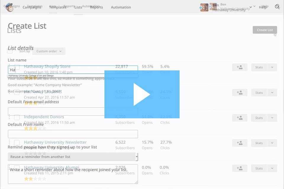
MailChimp
We’ve mentioned MailChimp a few times and that’s because they have amazing docs. They are colorful and welcoming and have clearly had lots of effort put into them.
 Here we’ve got brilliant article layouts that include a breakdown of what exactly is contained in the article, related articles and contextual information.

This is a fantastic example of using information architecture to signpost your users with their location in your knowledge base and the surrounding content.
This article not only helps users but points them in a different direction if it turns out this is not exactly what they’re looking for.
MailChimp uses Wistia to create handy video tutorials to walk their users through common tasks in the platform.
Customer.io
Customer.io sells software that automates customer lifecycle emails and campaigns. This means their own customer experience is top-notch because they are living up to their values with great docs.

It’s all about the great color scheme for your documentation. Sea-green is a calming color that helps put people in the right frame of mind for learning, and the simple grey symbols help make this knowledge base more visually appealing for users.
Arranging the topics into cards makes it easier to scan for what you need, rather than presenting the options in a text list like many do.


Each subcategory contains a list of fine-grain topics that a customer might want to know about. This Customer.io knowledge base is perfectly optimized for browsing.
The heading font is sans-serif Proxima Nova Bold and is right on trend for a clean, simple User Experience.
Zapier
Zapier is a platform to connect your applications and help you create a seamless workflow. Their knowledge base is clear, easy to use and beautifully laid out.

They make good use of negative space to guide the user’s eye round the initial options so they can orient themselves. The inclusion of a subtle illustration in the background adds a bit of character to Zapier’s docs and makes them seem more human.

The search bar is always clearly prominent in case a user decides it would be easier to just type in their query.
Otherwise, Zapier uses information architecture, namely in the left-hand menu, to indicate the options that are available in the knowledge base.

They make good use of images and screenshots when they reference something on the platform, visually representing complex concepts.
They also have videos that bring their documentation to life.
Teachable
Teachable is a platform for creating online courses and their knowledge base is heavily focused on onboarding their users. It makes sense that they would have a great knowledge base since their area of expertise is teaching.
It’s best practice for companies to highlight the search bar in their knowledge base and that’s exactly what Teachable has done here.

It makes fantastic use of cards with shadow to show the user what categories are available. This adds an impression of dynamism and depth to their knowledge base.

Custom illustrations show the user that Teachable cares about its knowledge base, and this style is evocative of other well-known customer support companies, like Helpscout and Kayako.
It creates the impression that Teachable values its customers enough to enhance the user experience.

Of course, there will always be times when the user has to speak to a human. Teachable makes this easy.
Some great developer docs
Developer docs are notorious for being dense, hard to use, disorganized and not visually pleasing. That’s why these docs are notable for bucking the trend and even making use of illustrations to engage their users.
Stripe
Stripe is a payment processing platform that is well-known for having beautiful docs. Technical documentation is difficult to convey simply but Stripe have done it by paying close attention to what their users need from them.

Like Teachable, they have included cards with shadow to guide the user towards their knowledge categories. The simple blue and grey colour scheme is calming and professional, perfect for when users are freaking out over a technical issue.

They use the left-hand menu to display the many subcategories and content topics available so developers can glance over to find what they need. They embed notes into their content pages that may give added helpful context to the user.
The Go programming language
It’s no easy task to document a programming language and partly for that reason, many languages are lacking critical documentation.
Go has bucked the trend because they’ve managed to lay out their documentation site in an enticing way that can appeal to even beginner users.
 The inclusion of their cute gopher mascot makes their docs seem welcoming and a bit quirky. Although simple, their knowledge base has a distinct personality.
They’ve even made a screencast with instructions on how to write, build, install, and test Go code.
<iframe width="640" height="360" src="https://www.youtube-nocookie.com/embed/XCsL89YtqCs" frameborder="0" allowfullscreen></iframe>
And they have an interactive tour of Go available in different languages:

Marvel API docs
Believe it or not, Marvel has API docs and they’re great.
They’re aimed at developers who want to may want to use the Marvel comics canon to create digital products.
By including their signature artwork, they make their docs all part of the Marvel experience.

They’ve gone for the standard minimalist presentation of their content which is probably best when it comes to technical documentation.

They’ve struck a relatively casual tone which is in keeping with the Marvel brand, yet still achieves clarity in the documentation.
Their docs are actually interactive so you can test out different API calls using various parameters.

Hitchhikers Guide to Python
This Python guide as an absolute contrast to the usual Python documentation.
Their documentation site infuses the fandom of the Hitchhiker's Guide to the Galaxy series to make programming in Python more down-to-earth and accessible.

It uses humour and in-jokes from the Hitchhiker series to create a sense of camaraderie with the user.

Images break up the extensive text necessary for developer documentation, and they’re probably familiar memes to most programmers. They explain terms and applications fairly clearly and don’t assume too much prior knowledge.
The programming world can be a bit of an exclusive clubhouse but Hitchhiker’s Guide to Python do a good job of welcoming new users.
Final remarks
Good knowledge bases should be an extension of the brand personality of your company. You should put as much effort into the User Experience and branding of your docs as you would into your product marketing content.
Custom illustrations are in the future of knowledge bases. So is sensible use of design principles to create a flawless user experience.
We are moving away from lists and text towards a more visual trend in knowledge bases. This will make the use of online docs sites more pleasant, and even fun.
No matter what your industry, your docs should create a pleasurable long-term experience for your customers. They should be far more than a cost-saving measure or afterthought.
Stretch your documentation wings and try our knowledge base software KnowledgeOwl for free.

Subscribe and get notified as new blog posts arrive
(No spam, pinky promise)


Writing docs
(225)

General posts useful to all documentarians about writing documentation, editing and publishing workflows, and more.

Feature spotlight
(11)
Your flight plan for how to get the most out of KnowledgeOwl features and integrate them into your workflows.

Announcements
(21)
Major KnowledgeOwl company announcements.

Customer stories
(8)
Learn how others are using KnowledgeOwl & get pro tips on how to make the most of KO!

Company culture
(36)
Find out more about who we are and what we value.

Support
(58)
We believe good support is the foundation of good business. Learn about support tools and methodology.

Tools
(40)
Learn more about tools to solve various documentarian issues, within and beyond KnowledgeOwl.

All
(344)
Not sure what category you need? Browse all the posts on our blog.

Got an idea for a post you'd like to read...or write?
We're always looking for guest bloggers.
Learn moreStart building your knowledge base today
- 30 days free (and easy to extend!)
- No credit card required
- Affordable, transparent pricing
- No cost for readers, only authors
Want to see it in action?
Watch a 5-minute video and schedule time to speak with one of our owls.