All articles
Psychological principles for knowledge base Information Architecture
Using the principles of psychology is an important part of designing your knowledge base Information Architecture. Your knowledge of these principles has implications for the conceptual layout of your knowledge base and overall documentation design.
Published
Category
Psychological principles for knowledge base Information Architecture
Catherine Heath | March 15, 2019
Author's note: Thanks to support sorceress and cheesemonger Kate Mueller for her substantial contribution to this post.
Using the principles of psychology can help you improve the design and the Information Architecture of your knowledge base. Your knowledge of these principles will change how you lay out your knowledge base, and how you design your documentation.
Technical writers don't have to become full-fledged academic psychologists, but they can benefit from gaining a working knowledge of this field. Focus on the end goal – enabling users to more quickly and efficiently solve whatever problem they were having with your product.
We’ve come up with a list of psychological principles to keep in mind, along with some handy real-life examples. This article is long, so feel free to grab a brew and settle down for a while. Or, you can read each section as an individual article.
Cognitive Load Theory
Cognitive Load Theory was advanced by John Sweller based on information processing research. Human short term memory can only contain a limited number of elements. This is why you shouldn't overload your users with too much information at once.
The human mind forms schemas (theories) in the long-term memory. Schemas are employed during learning to reduce cognitive load, to make the learning experience easier. It's one of the factors that distinguishes an expert in a field from a novice.
Novices have not learned the relevant schemas yet. That's why you need to break the information down into smaller chunks to makes them easier to absorb. Schemas are like mental models, which we talk about later in this article.
Once a novice learns a new schema, more of their working memory can be freed up for the task at hand. Cognitive load remains the same, but intermediate or experienced users can use more sophisticated schemas that increase their learning capacity.
It’s important to identify whether your users are novice, intermediate, or expert, so you can pitch your documentation accordingly. Theoretically you as the technical writer are always at least intermediate with your product. You are not your user.
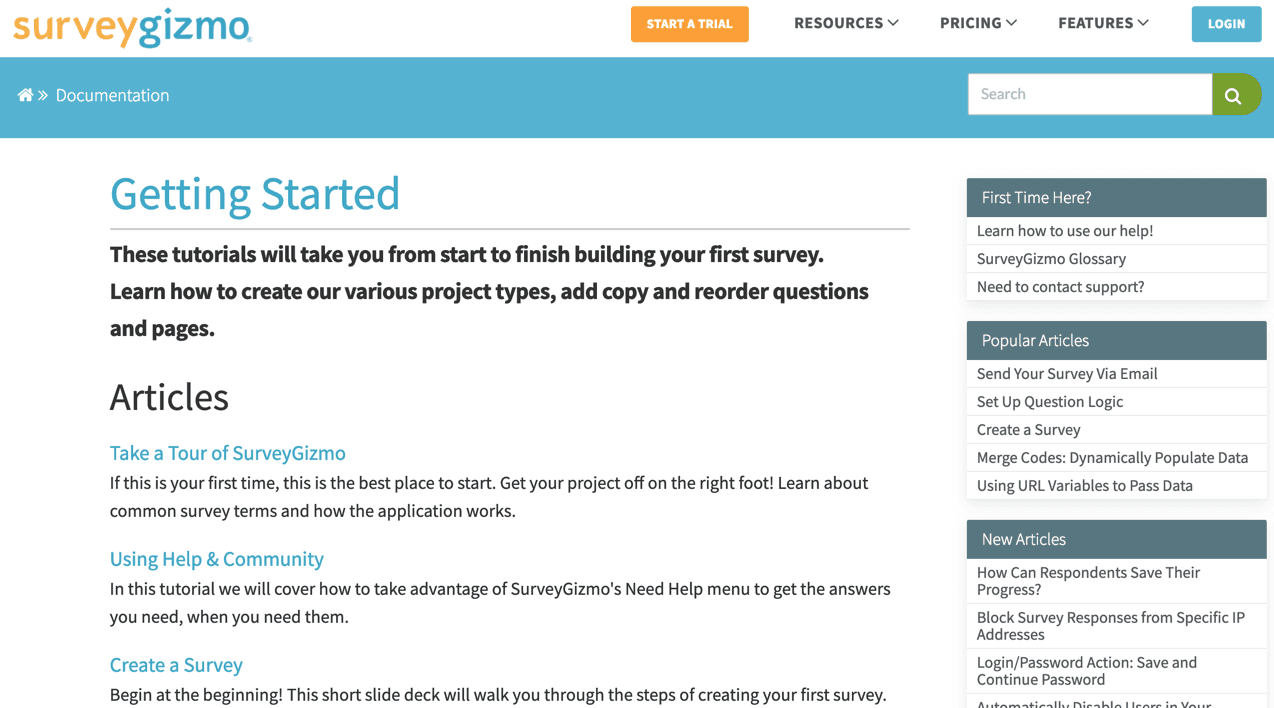
Cognitive Load Theory is potentially important for Information Architecture. It supports one method of entry or access, where users are strongly guided and curated (like a Getting Started guide). The aim is to get your novice users ramped up to competent as quickly as possible.
Here's an example of a great Getting Started guide from SurveyGizmo.
The concept of cognitive load relates to the Dunning-Kruger effect on novice users' ability level, which we cover in the next section.
Dunning–Kruger effect
The Dunning-Kruger effect describes the phenomenon in which amateurs are cognitively biased towards mistakenly believing they possess a higher level of ability than reality.
Your novice users are likely to rate themselves as more skilled with using your product. You can't rely on your users to be accurately aware of the skills they need to be successful. This has implications for both onboarding with your product, and the entire user journey.
As a designer of a knowledge base, you need to construct the User Experience in such a way as to guide users towards the knowledge they need to succeed. Don't just expect your users to find it for themselves.
Use a glossary to explain terms folks may not understand, or use a widget to provide contextual help right where users need it in your app. Create robust, pleasant onboarding to help users get to know your product.
Take Asana as an example:
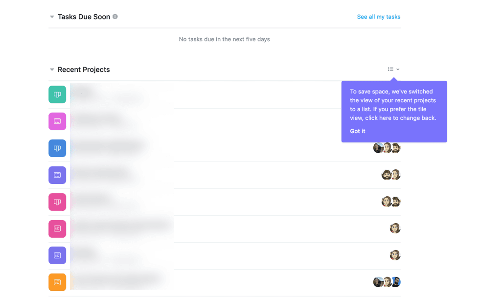
Example from Asana's app
Asana has implemented contextual help to pop up whenever there is an action that could help users with their productivity that they might not know about.
Or this glossary from Mozilla:
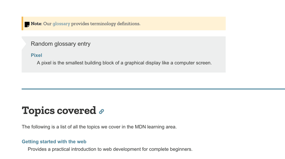
Mozilla example
Combating the Dunning-Kruger effect is especially important if your product is particularly innovative. Next, we'll learn how a desire to see the whole picture influences your users.
The Law of Pragnanz
Also known as the Law of Simplicity, the Law of Pragnanz holds that people need to see the "whole picture". We simplify complexity by mentally merging separate elements into a unified whole, so we sometimes assume things are there – when they aren't.
Relating to Gestalt therapy, the Law of Pragnanz says that we first see something as a whole before beginning to deconstruct its constituent parts. Your users will perceive your help site or knowledge base as a whole, before breaking it down into individual concepts.
If they only see part of something, they have a tendency to fill in the blanks (reification – see next section). It's like how we instinctively see images in these black shapes:
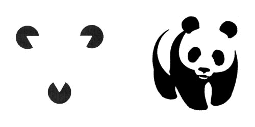
Image source: Smashing Magazine
This is important, because your users aren't necessarily encountering your knowledge base in its entirety. For example, in contextual help your user only sees a snippet of your documentation. The knowledge base is experienced as an extension of that whole snippet.
Or, if someone (like your agent) sends them a link to an article then they will only see that page – unless they choose to explore further.
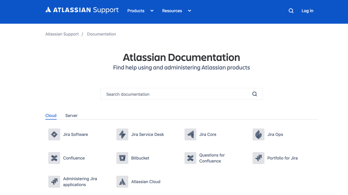
Atlassian example
In this example from Atlassian, users are helped to fill in the blanks by being shown a toggle menu between "Cloud" and "Server". This demonstrates that there is more documentation than they can currently see.
It should be possible to view your knowledge base as a whole, through the homepage or menu. This is where really good navigation and information architecture comes in.
Reification
As we mentioned before, reification is when our mind fills in the gaps to complete the picture. Keep this in mind when producing your documentation. Incomplete information means users will start to make assumptions about how something works – which are likely to be wrong.
If they’re viewing your documentation as the knowledge base, then they're likely to arrive with a set of their own pre-set assumptions. The idea of reification is key, since it's so hard to tell when there are gaps in your documentation.
Or, users will take shortcuts when the information they need is hard to find. They may potentially run into more problems with your product. Avoid errors by focusing on minimalism in your documentation, and also making it obvious where related information is kept. Every Page is Page One can help with this.
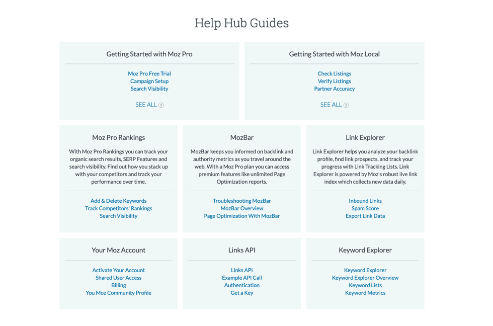
Moz example
Moz is a really good example of having lots of products, which might confuse users who arrive at their documentation. By clearly displaying each product along with top links, this helps minimize the risk of reification – perhaps assuming that there is no information for their chosen product.
To help in this area, take notes of all the places where customers still ask questions about your product, or where you get many support requests. Study the analytics of your knowledge base closely for hot pages or bounces. These are signs that users are trying to fill in gaps, and where your documentation could be improved.
The anchoring effect
Now we're going to talk about cognitive biases – perceptual distortions that affect how users might perceive reality. The first of these is the anchoring effect.
The anchoring effect is known as "A cognitive bias that describes the common human tendency to rely too heavily on the first piece of information offered (the "anchor") when making decisions," according to Harvard Law School. In any given situation, you are biased by the first piece of information you see. You go on to use this anchor as a reference point when making later decisions.
The trouble is, in your knowledge base, you're unlikely to know what "anchors" your users are coming to your documentation armed with. Keep in mind that your user’s reference points may even predate their use of your product, relating to other – similar – situations.
For example, if a user has previously been using a related product that included a feature as a top-level navigation item, but your product includes it nested somewhere else, they may perceive your product as either not having the feature or being more difficult to use.
The anchoring effect is somewhat related to the job of marketing, in that you are working to challenge your user's preconceived notions about this type of product.
You could fix this type of situation by explaining in your documentation exactly why your product has been set up in this way. Showing empathy will go some way in offsetting the anchoring effect. This is especially important if your product is doing an old thing in a new way, like Stoplight.
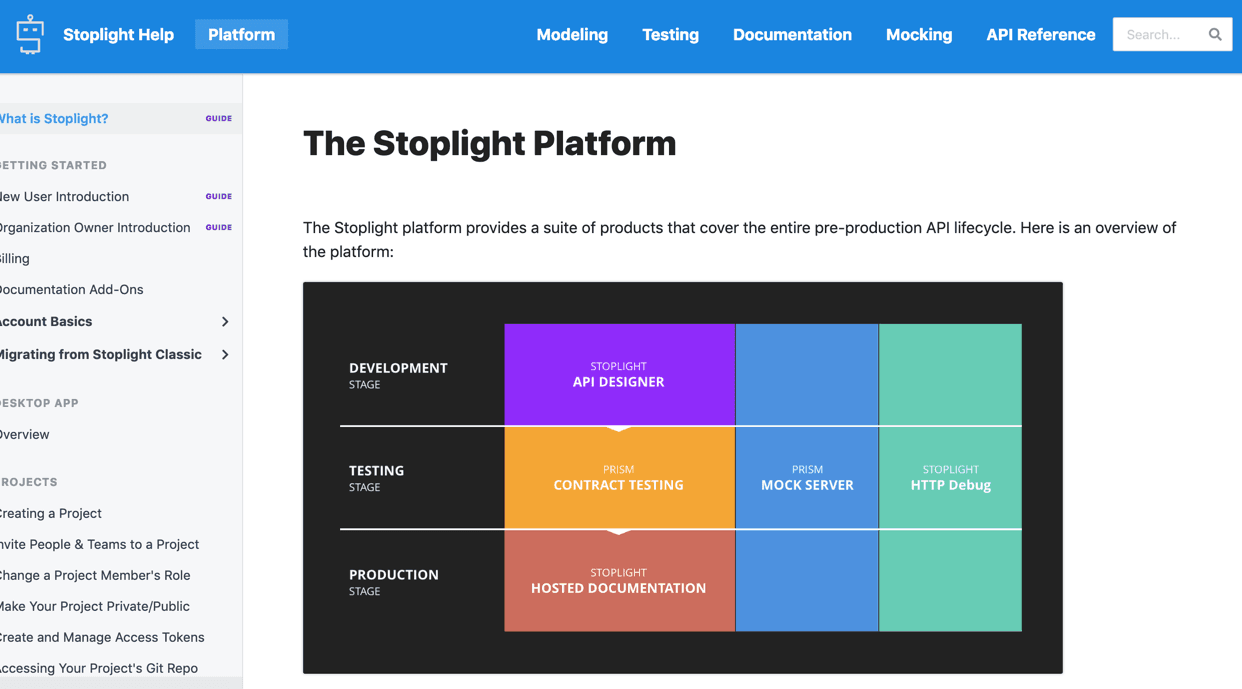
Stoplight example
Stoplight is visually representing its product with a diagram, since it is a visual way to model and document APIs. New users may need more onboarding due to their expectation of writing APIs in the traditional way.
The Halo Effect
The Halo Effect is another powerful type of cognitive bias. It's where we allow our impressions in one area to bleed over into our impressions of another – even though the two areas may not be related. The term was first coined by psychologist Edward Thorndike in 1920.
The Halo Effect doesn't necessarily mean someone has a positive cognitive bias. Think of it like contamination. We think that if someone is good at doing A, they are good at doing B. And the Halo Effect is strongly influenced by first impressions, relating it to the anchoring effect.
So let's put it another way – the overall impression of your knowledge base is important. If your user encounters one area, like a Getting Started guide, and forms a positive impression, this is likely to hold true for your entire knowledge base.
If your guide is a bit poor, then users will judge the rest of your knowledge base more harshly – no matter how good it is.
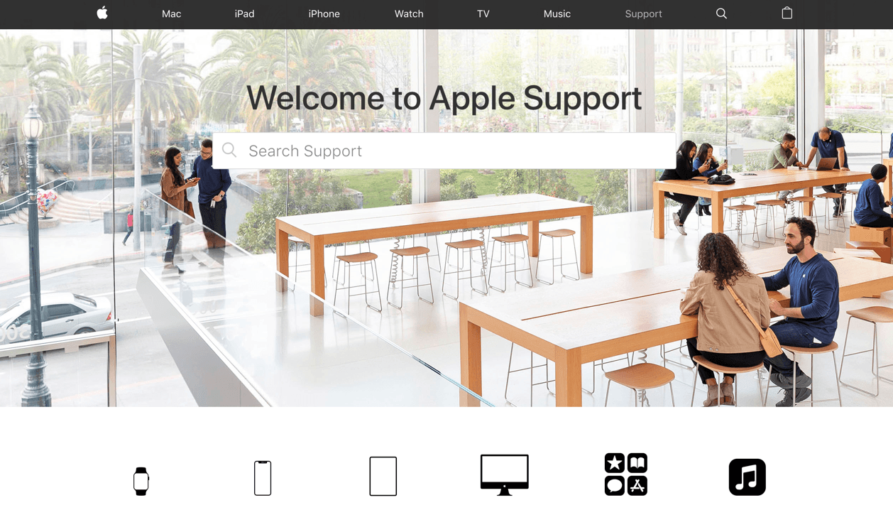
Apple example
Just take Apple as an example. In keeping with their products, Apple's knowledge base is sleek and beautiful. Users are likely to look upon documentation more favourably if it's presented nicely – regardless of the actual quality.
Pleasure-pain principle
The Halo Effect links in nicely with our next topics – motivating your users by offering them pleasure. This is far better than users only turning to your documentation in pain, which is the most likely scenario. The pain of using your documentation should not be greater than quitting your product altogether.
Sigmund Freud’s pleasure-pain principle postulates that humans are motivated to seek pleasure and avoid pain. The human mind tends to seek instant gratification. It's the part of your user’s psyche that rebels against unfairness – the unfairness of what they might see as the inconvenience of sometimes having to use documentation in the first place.
Very few folks read documentation to just learn how a thing works, or for fun. Most people only look for documentation when they are battling pain. This is when something isn’t working properly or they are already frustrated. Ameliorate the "unfairness" of users having to use docs in the first place. Make your documentation a source of pleasure if possible – rather than pain.
It's a helpful reader context to keep in mind for all documentation: that people are already coming frustrated and the more pleasurable you can make your documentation experience, the happier they’ll walk away. It's important to invest in designing your docs to be as simple and pleasing as possible, to offset some of the pain they're experiencing.
Don't make your users go through more effort to find their answer than is minimally possible. Take inspiration from Mailchimp, who illustrate their documentation beautifully:
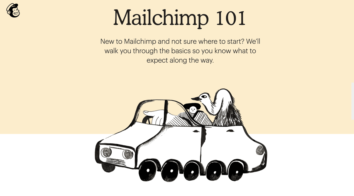
Mailchimp example
Immediately upon encountering the docs, your users feel valued.
Ellsberg Paradox
The Ellsberg Paradox is when people would rather make a decision with low odds of success rather than choose an option with ambiguity. It was first theorized by Daniel Ellsberg, who called this kind of behavior "ambiguity aversion".
Your users do not like ambiguity. And the more educated they are, the less your users like ambiguity. It's one of the reasons why it's hard to get customers for new brands or products.
So removing ambiguity in your documentation is crucial to improving the User Experience and increasing adoption.
This makes a good argument for removing content or features that create ambiguity – multiple knowledge base sites, duplicated content, outdated content, and content that is just plain wrong.
Of course, sometimes errors and ambiguity can't be avoid. In this case, it helps to signpost your users like Spotify, who have designed a clever 404 page to reorient their users:

Spotify example: image source
UX techniques like this help users to feel taken care of, and make ambiguity more insignificant.
Mental models
Mental models help people to learn from past experience, and they are closely related to schemas. Mental models are very important for documentation.
According to Nielsen Norman Group, "A mental model is based on belief, not facts: that is, it's a model of what users know (or think they know) about a system such as your website." Mental models may or may not be closely correlated with reality.
Mental models serve an important function since they are incredibly useful for functioning in the world. For example, we might have a mental model about the simplest solution being the most effective. This helps us succeed in life and avoid wasting precious energy. It's too much effort to constantly pay attention to new, incoming data.
Using the correct mental model is crucial for users grappling both with your product and your knowledge base. Closely matching your own active mental models with your users' mental models is key to writing good documentation.
For example, Help Scout are using a mental model in their knowledge base:
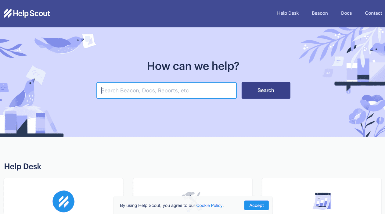
Help Scout example
By asking users "How can we help?", they are invoking the image of a helpful customer service assistant. It's a self-service knowledge base, but users instinctively understand that they should type their issue into the search bar, since they won't be able to resist answering a question.
They also use mental models by providing an overview of the different categories:
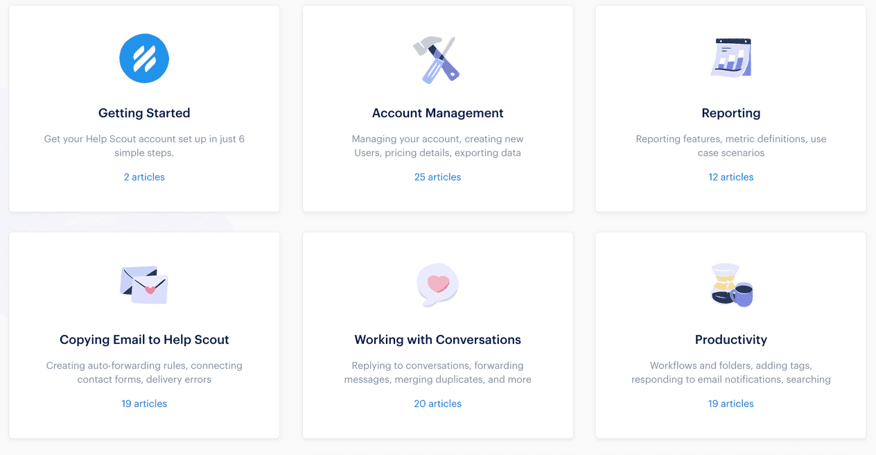
Help Scout mental models
Users are able to visualize and model the knowledge base better, and become empowered to find the information they need.
Self-directed learning theory
Mental models are particularly important for new users.
Self-directed learning theory shows that when having to learn a new topic, novices will use any mental model or scaffold that they already have that feels like it might be similar. Only over time, as users develop more expertise, do they develop a mental model more specific to this new area of interest.
Learning theory states that you should provide either obvious metaphors, or really obvious models/scaffolding in the beginning. Then you gradually phase your models out over time as students develop their own expertise.
This is another argument in favor of having a clear Getting Started guide or something similar. You provide the mental model of what’s important for new users. Pick something people are likely to already know, even if it's not 100% perfect.
For example, Zapier needs to explain their product to many users who don't have a developer background. It's tricky to explain APIs in general, but they do it well with their mental model:

Zapier example
Zapier refers to each app connection as a "Zap", which is easy to remember and non-threatening.
Your documentation needs to be explanatory enough that new readers can make sense of an unfamiliar world. It should also be concise enough that experienced readers aren’t impatiently slogging through a ton of stuff they already "know."
Information scent
According to Nielsen Norman Group, "Information scent refers to the extent to which users can predict what they will find if they pursue a certain path through a website." You need to make things obvious so your users can find them, and it's crucial that you purposely use Information Architecture.
Information scent is related to Information Foraging theory, which likens people seeking information to animals foraging for food. They will keep going as long as they keep finding clues that they are approaching their goal. As soon as the trail dries up, users give up searching for the information.
Provide clues to aid your users' situational awareness in individual articles, like including links to other articles within the body or at the end. Folks can easily navigate to other related topics in case this content wasn’t *exactly* what they needed to find.
You can also make use of "Related Articles" functionality, which curates a good list of Related Articles to help folks find what they need. Just take this Freshchat example:
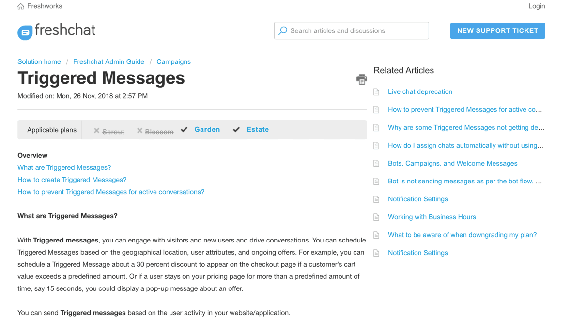
Freshchat example
Related articles encourage content exploration, and increase the chance that your users can probably diagnose the problem. If the content doesn't work and users get stuck, this increases the likelihood users will churn from your product! And a prominent "contact support" button is a nice touch, too.
Structure your information in a way that enables users to form a proper mental model of your website. Use the words your users are likely to know, and eliminate confusing elements that disrupt the information trail.
Visual salience
Information can also be represented visually, so don't forget to use visual cues to guide users around your documentation.
Visual salience is the psychological mechanism that enables us to "rapidly detect potential prey, predators, or mates in a cluttered visual world." The nature of perception means that some objects stand out from the background and from other objects.
For example, a flashing red sign has strong visual salience. It’s one of the reasons why we can only process a small area or a few objects at a time – not everything can have the same level of significance.
This is particularly relevant in the arena of your knowledge base, where users are heavily relying on visual information to tell them what to do. You can use visual salience in your documentation to direct your user’s attention to important information.
For example, include warning call-outs to highlight information you want your users to notice above all else.
Again, Mozilla makes great use of warnings in their documentation:

Mozilla example
Less is more when it comes to visual salience. Avoid overwhelm by reducing the number of visually salient elements, to avoid them competing for your users' attention.
The Paradox of Choice or Hick's Law
We think that people like options, but actually having too much choice is overwhelming. Too many choices leads to analysis paralysis and an inability to ultimately make a decision. We psychologically suffer when we have too many options.
In the Paradox of Choice, Barry Schwartz [2] says: "Though modern Americans have more choice than any group of people ever has before, and thus, presumably, more freedom and autonomy, we don't seem to be benefiting from it psychologically."
We’d rather have a selection of three types of jam to choose from – rather than, say, 100 types.
Unfortunately, people very often seem to feel that if they just give everyone access to all information, like Field of Dreams, magically people will find what they need.

Field of Dreams: image source
In studies of user adoption in new technologies around wiki usage, highly structured environments stifled user adoption and participation. Totally blank canvases fared even worse. In conclusion, a small amount of structure with clear guidelines seems to be the best middle ground when it comes to providing choices.
Hick's Law states that the more options someone has, the longer it takes them to decide between them. It's represented by this diagram:

Reducing the time it takes to make a decisions is key to a successful learning experience in your knowledge base. Just take Prodpad:
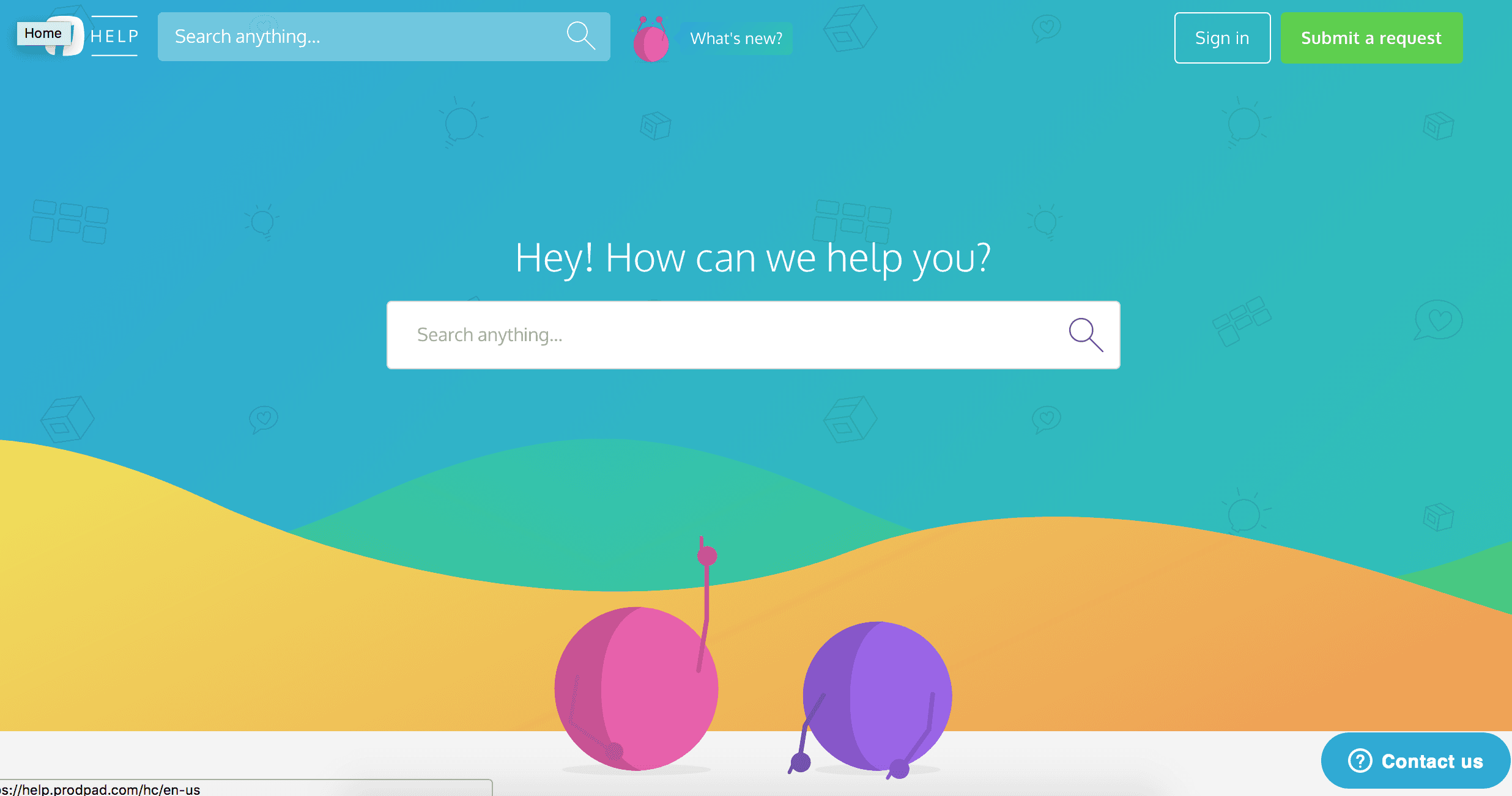
Prodpad example
Users pretty much have one option: search for what they want. Simple but effective.
In your documentation, don’t give your users too much of a choice when it comes to solving their problems. Instead:
Just have one article per topic, and if you need more than one then consider splitting it out into subtopics.
Delete outdated content, archive it, or set it to unpublished.
Offer a primary way of troubleshooting problems, and only after exhausting that option should you reveal another way.
Spend some time thinking about how people will engage with content and how to structure it. Avoid being too rigid in how it’s laid out, and pay attention to what people actually focus on.
Pattern recognition
Human beings are primed to seek patterns in our experiences, which we later use for pattern recognition.
Pattern recognition is what helps us to understand language, to recognize the faces of people we know, and to appreciate music. Pattern recognition is fundamental to being consciously human.
We store patterns in our long-term memory and then match them with current stimuli. Learning patterns help us to predict what might happen in the future, and use mental shortcuts to help us make better decisions.
In your documentation, try to use meaningful patterns when arranging the information to help the user learn your mental models more quickly. Avoid creating patterns that have no meaning, as this will increase cognitive load and throw off the information scent. This includes patterns that are important to your internal staff or higher ups, but have no meaning for your users.
Patterns are related to categorization, so categorize your articles and topics in a meaningful way.
Wonderbly example
Wonderbly is a great example of using a visual pattern to create expectations for users. These colorful logos suggest that each of these topics is on the same level in a hierarchy. When you hover, each square spins to reveal a submenu of options.
Over to you!
As you’ve probably noticed, many of these psychological principles overlap with each other.
Try to apply as many principles as you can in your Information Architecture to help your users reach their end goal: solving whatever problem they have with your product.
Our very own knowledge base software KnowledgeOwl can help you create delightful documentation for your users. Take it for a free spin now.
References
[1] The Nurnberg Funnel: Designing Minimalist Instruction for Practical Computer Skill (1990) By John M. Carroll
[2] The Paradox of Choice: Why More Is Less (2005) By Barry Schwartz
{{snippet.authorCatherineHeath}} {{snippet.Disqus}}

Written by
Catherine Heath
Catherine is a freelance writer based in Manchester who writes blogs, social media content, and copy. She also designs owl-based images. 🦉

Follow these 3 steps to improve your knowledge base
1
Get expert tips every month in your inbox
No spam, pinky promise.


2
Try the knowledge base software your team will fall in love with
Reduce tickets, make information easy to find.
Happier employees, happier customers.

3
Become the tech writer everyone respects
Check out our podcast, The Not-Boring Tech Writer.

How teams are using KnowledgeOwl
Loved by 3,200+ knowledge base authors in software companies around the world