All articles
The evolution of a logo: 50 shades of Linus
As with any other customer-focused business, an effective logo is vital in representing a company and what it stands for. We thought we would share a little about our rebranding journey to give you an insight into how we came up with our new logo.
Published
Category
The evolution of a logo:
50 shades of Linus
Stephen Zappia | September 1, 2016
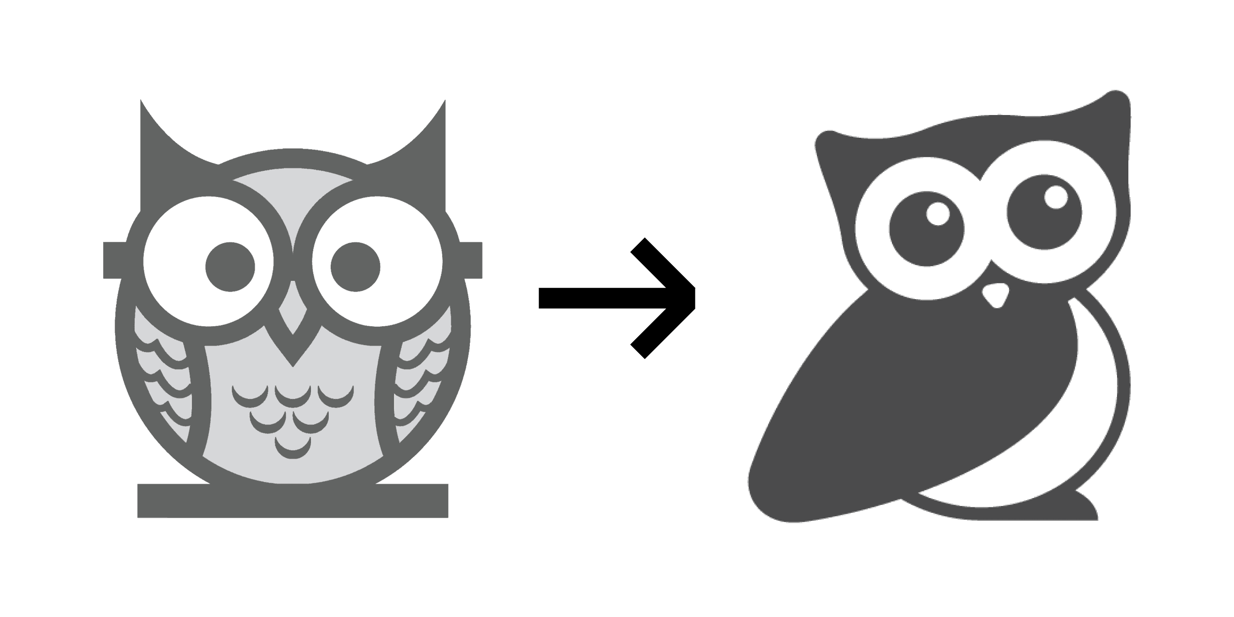
Along with other changes to our website and the KnowledgeOwl app, you will have noticed our owl has changed. Our old logo owl looked like this:

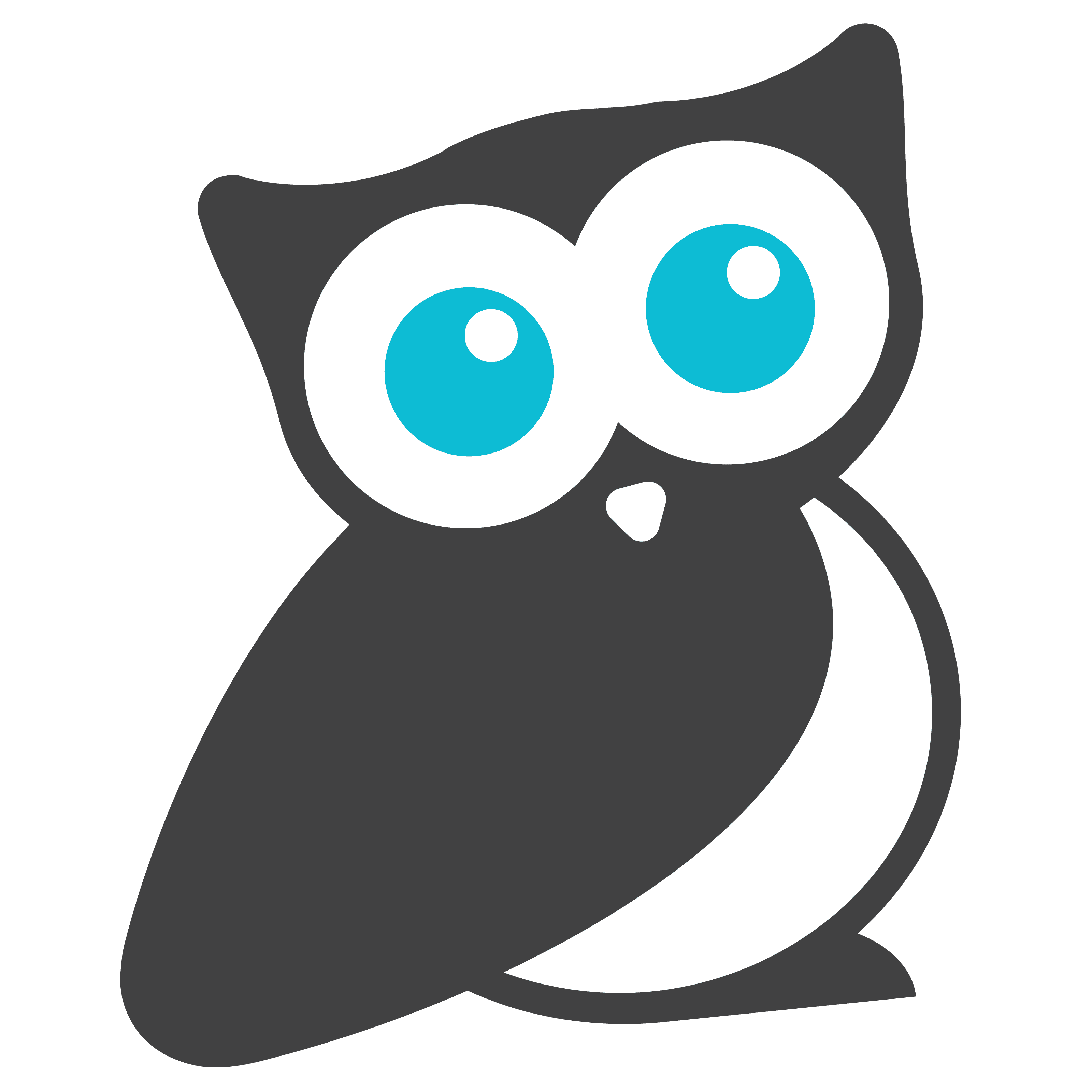
And our new logo features our new KnowledgeOwl mascot, Linus!
As with any other customer-focused business, an effective logo is vital in representing a company and what it stands for. We thought we would share a little about our rebranding journey to give you an insight into how we came up with our new logo. Maybe even help other businesses out there who are going through the same exercise.
Linus who?
Considering our name, an owl obviously made the most sense to represent KnowledgeOwl. Owls are also considered to be symbols of knowledge and wisdom in many cultures. Plus it helps that they are super cute!
Our first owl was part of a logo we purchased when we first rebranded as KnowledgeOwl. We stumbled across an amazingly appropriate logo on BrandCrowd, and around that same time we realized that the "knowledgeowl.com" domain was available, which made the transition much easier for us. Plus we thought it was clever and would make great t-shirts.
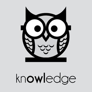
Sunil (we decided he needed a name too) served us well, but he didn't really work as a favicon or in white on colored backgrounds, which was problematic for us. So we engaged an awesome designer from Fiverr (Hi Adrian!) to create one, and this was the result:
We loved him straight away, but felt he lacked something, a touch of color if you will. We started by giving him a name - we got the name Linus from Fabulinus, a Roman god of wisdom. Then our evolutionary process began, and like many businesses, this involved one of the most important aspects of a logo - color. And boy did we come close to leaving the "Fabu-" before his name!
All the Colors of the Rainbow
Color psychology in marketing and branding is an intriguing subject, I highly recommend reading into it. The way we humans respond to different colors is pretty fascinating. Settling on which colors to use, however, turned out to be a lot harder than anticipated.
We are a friendly, customer-focused business, with a product that helps our clients maintain and communicate their business' knowledge. Our product is easy to use, inexpensive, and very accessible.

So as you can imagine, we got so excited about all the colorful possibilities we went through quite a few versions of Linus.
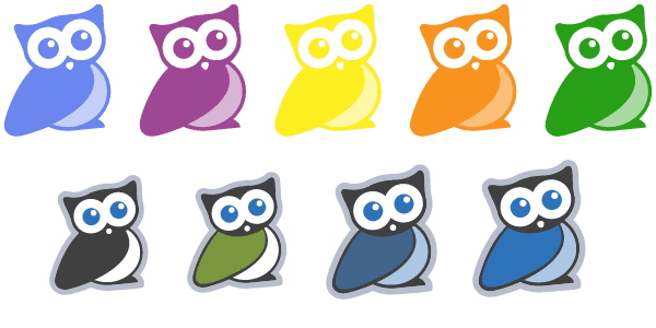
We even went a little overboard with colors. Alright, a lot overboard...
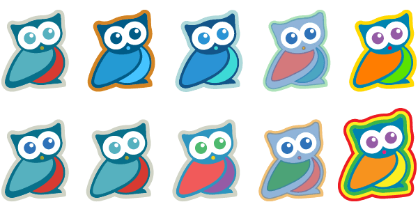
So you can see why Fabulinus was a fitting origin for his name - wise AND fabulous! However it became clear that we needed to simplify. One color stood out above the rest, so ultimately Linus was given a simple charcoal body with friendly light blue eyes. Lovely!
Less is More
The cliche is true - Linus' evolution taught us that when it comes to logo creation, focusing on just one or two colors is a good way to go. We could not be happier with Linus, and we hope you love him as much as we do!
And do not worry - all those variations will not completely go to waste. You might see a few versions of Linus in various places on our website and through our app. If you are lucky, you might even catch a glimpse of the rare and exotic FabuLinus!
{{snippet.StephenZappia}}
{{snippet.Disqus}}

Written by
Stephen Zappia
Stephen is a digital dynamo and creative crackerjack! He's got many levels of experience in IT, customer service, retail operations and Diablo 3. He has a passion for theatre and design - when not working on software he's performing on stage or redecorating his living room. You can find him at his home in Melbourne, Australia, or on LinkedIn

Follow these 3 steps to improve your knowledge base
1
Get expert tips every month in your inbox
No spam, pinky promise.


2
Try the knowledge base software your team will fall in love with
Reduce tickets, make information easy to find.
Happier employees, happier customers.

3
Become the tech writer everyone respects
Check out our podcast, The Not-Boring Tech Writer.

How teams are using KnowledgeOwl
Loved by 3,200+ knowledge base authors in software companies around the world