All articles
Examples of beautiful docs to inspire your self-service content
Learn how to make your documentation sparkle by examining how other organizations apply the concepts of beauty to their knowledge bases.
Published
Category
Examples of beautiful docs to inspire your self-service content
Catherine Heath | April 9, 2018
Beauty is very subjective. Many arguments rage over what is ‘beautiful’ – but we’d like to apply the concept of beauty to knowledge bases, with tips on how you can make yours more beautiful.
Unless we’re talking about fine art, beauty isn’t found only in form but also in function. Your docs are beautiful in part when they fulfil their purpose, which is educating your customers and helping them solve a problem.
Docs are beautiful when they fulfil this function properly and also have a form that's pleasing to the eye.
Unfortunately, many help centers can be a bit dry and boring. Companies don’t see this as an area where they can be creative and they view it as a necessary cost.
We’re here to change that perception! Even if your docs are boring now, you have the opportunity to improve them.
Design-focused companies often have very beautiful docs, partly because it showcases their love for design. This moves the emphasis away from seeing your customer support as a cost-center, and towards taking advantage of an opportunity to show your personality and engage your customers.
Wistia
Video support software company Wistia has really nice docs. They use a calming pastel color palette and informal copy that immediately puts their user at ease.
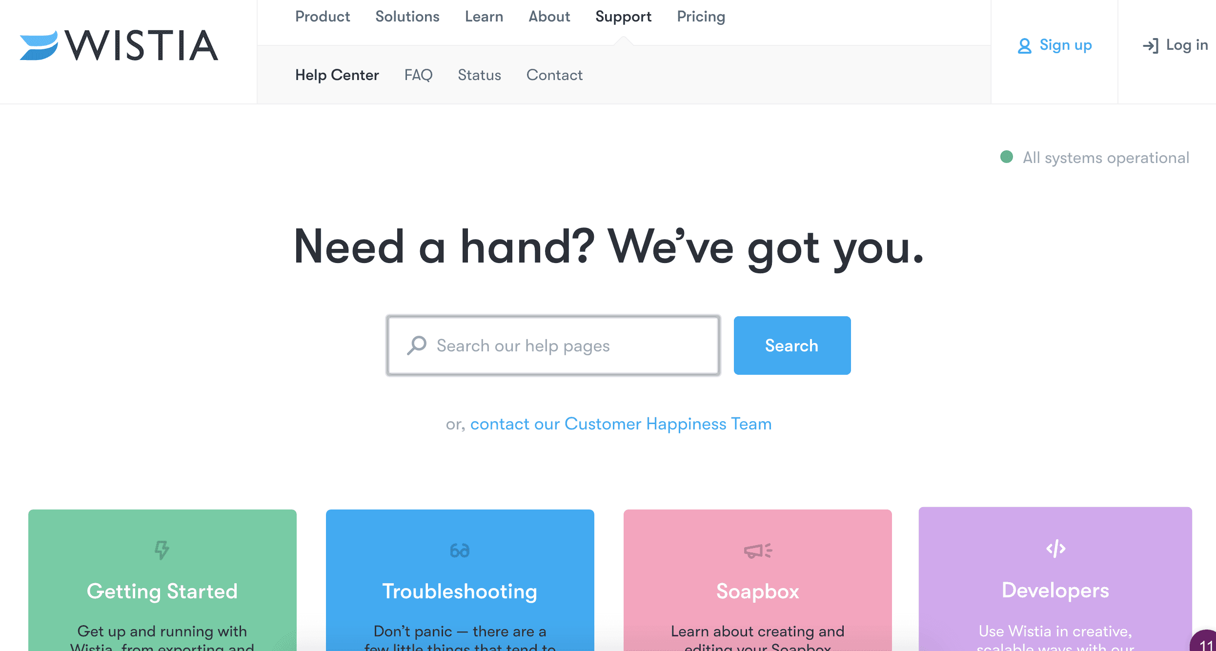
Customer choice
Their knowledge base design is good because they have included a link to contact their support team directly under the search bar. This encourages customers to call a human rather than forcing them to use a machine – not standard practice for many companies. The key here is choice, and it makes your customers feel like you care about them.
Real-time updates
Having a real-time status update in the upper right-hand corner is a nice addition. It shows that this software company is actively in touch with their customers and is committed to quality service.
Prodpad
Next we’ll take a look at product management software company Prodpad. They have skillfully used color in their docs to bring to mind being at the beach on vacation. This gives the impression of being very welcoming and suggests their company is fun-loving.
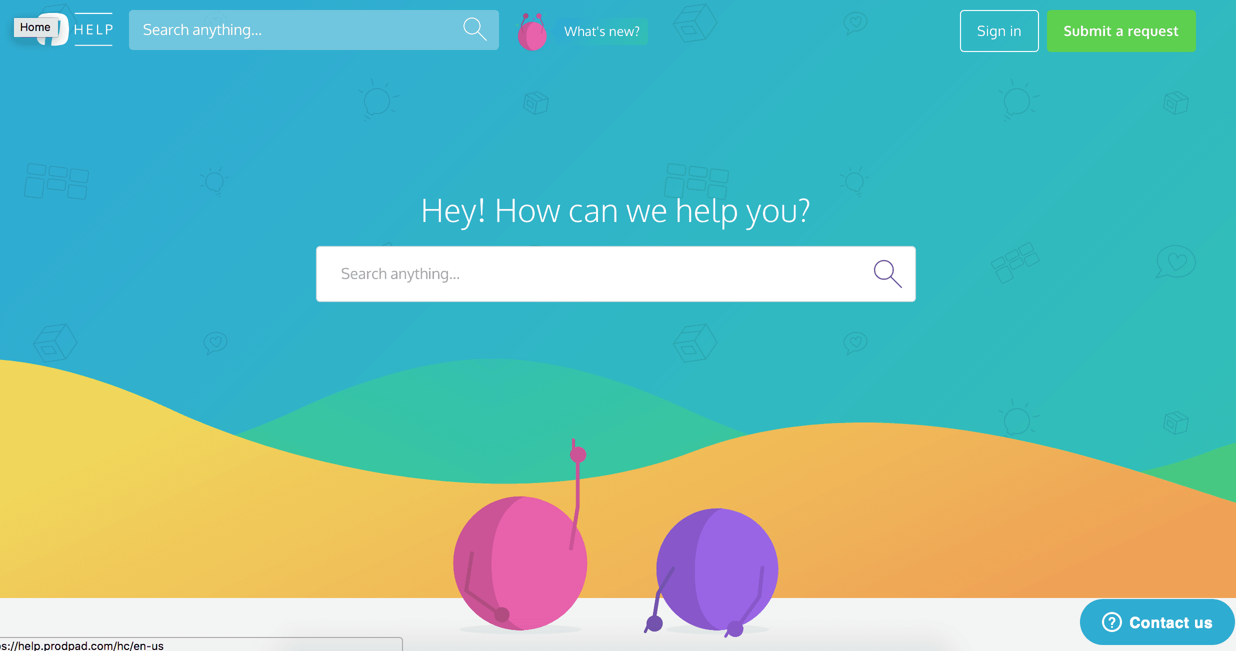
Design-led
Their knowledge base is in keeping with their design-led branding. Its sumptuous graphics feel relevant, modern and fresh.
As you can see with this next image, their whole brand is colorful and engaging, so it makes perfect sense that their docs are too.
Komfo
Social media analytics software Komfo is a slightly different example for our next knowledge base. They’ve gone for more of a corporate look in keeping with their brand, but their choice of regal purple makes their docs stand out.
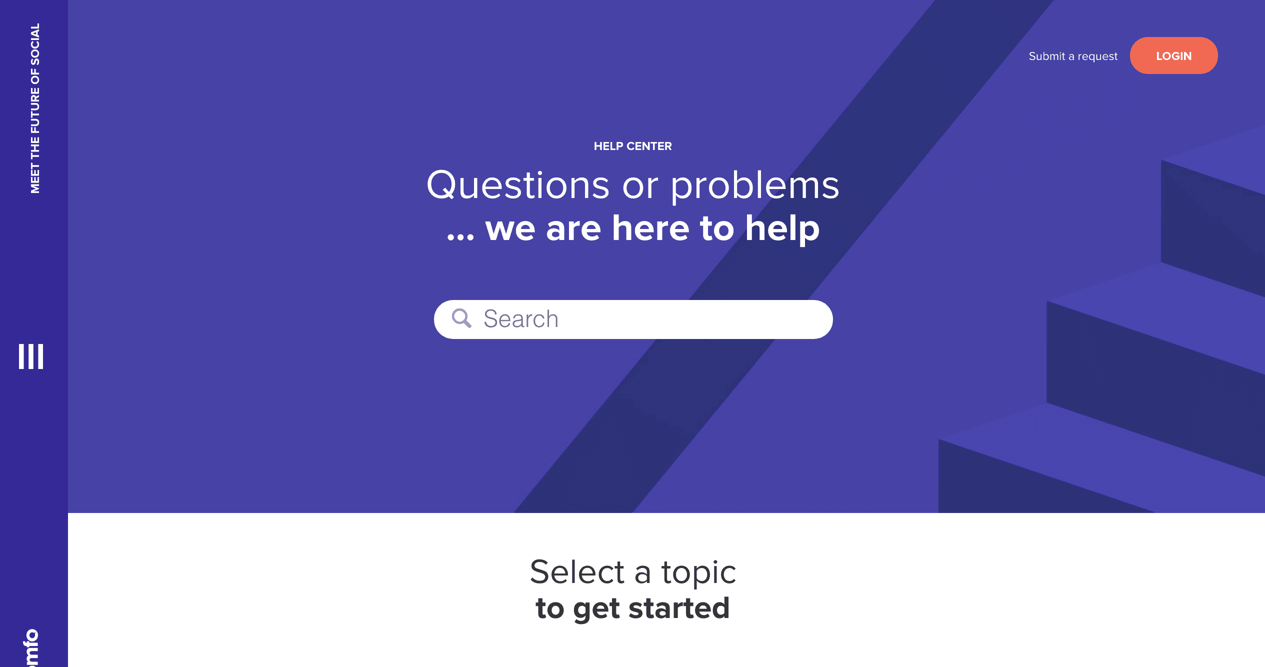
Good UX
They’ve used an appealing graphic as the background and left lots of space between their elements. This makes it very clear what Komfo wants users to do – either start typing in the search bar or click through to one of their top-level topics.

They make it easy to submit your questions and invite interactions in a welcoming way. The overall effort they have put into designing their knowledge base shows they care about customer support and helping people use their product successfully.
Dropbox
A definite style of help center is emerging – calming colors, lots of ‘white space’ and a prominent search bar.
File-hosting and sharing software company Dropbox are also going for a light and airy sort of knowledge base.
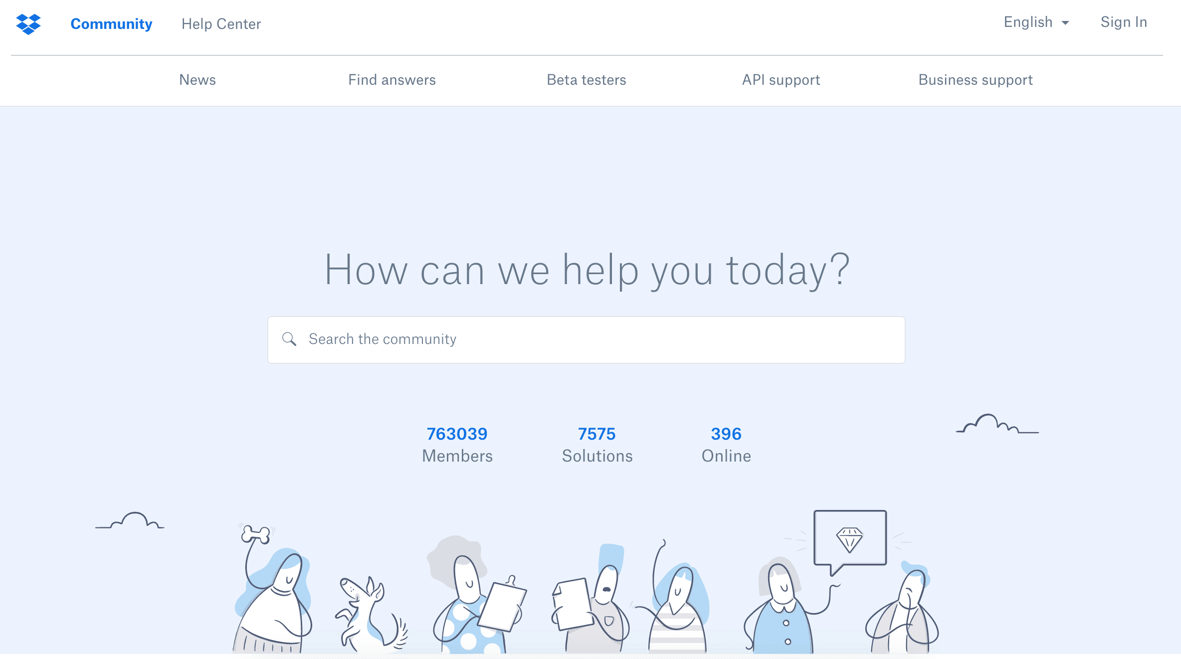
Prioritizing self-service
Having a beautifully-illustrated knowledge base is one way of suggesting that you expect your users to self-serve. It’s less like something has gone wrong than a natural characteristic of using their product. It means that your support strategy is an important part of your company’s mission.
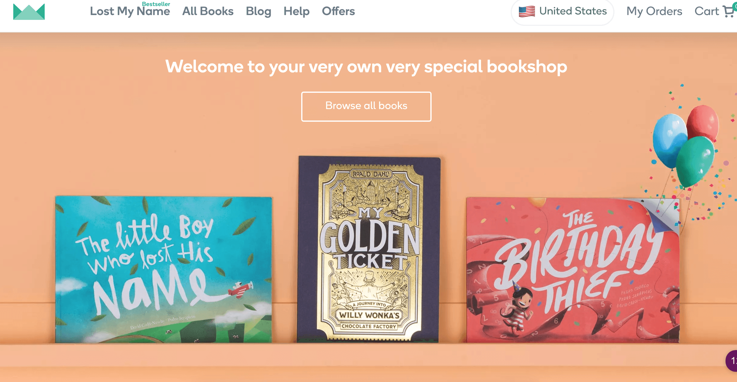
Wonderbly
Children’s book publishing startup Wonderbly has created a knowledge base in the spirit of their products. Breathtaking illustrations create a welcoming atmosphere as soon as users hit their knowledge base.
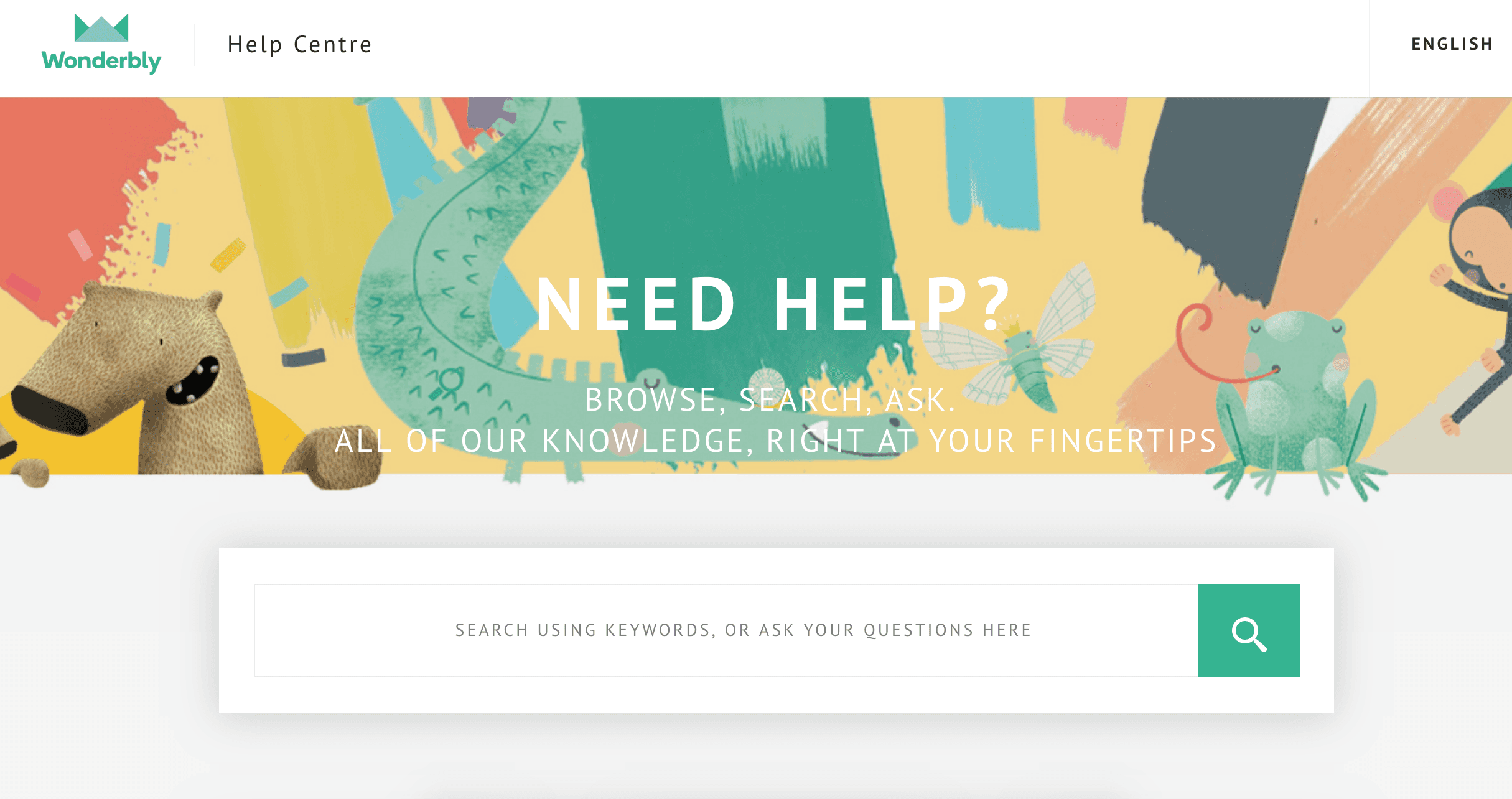
It shows that their knowledge base is an integral part of their brand. Even if you hadn’t purchased one of their products yet, seeing the illustrations may make you think of buying one of their books.
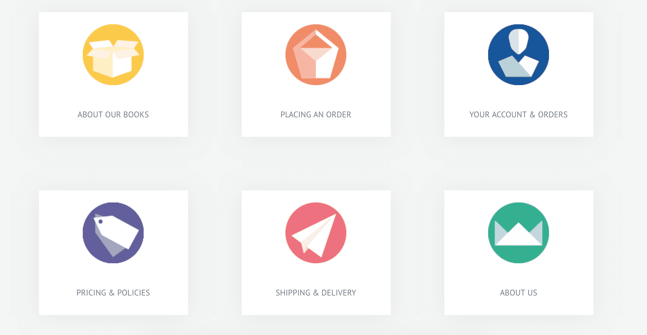
Keeping it simple
They organise their most common queries into categories that are represented by simple avatars. It’s important to maintain usability even while embellishing your knowledge base.
Ankama
Of course, this knowledge base is our clear favorite.
Ankama is a computer game and they use illustrations from their game to add liveliness to their knowledge base. In this case, it’s an owl with a quill to represent knowledge and learning.
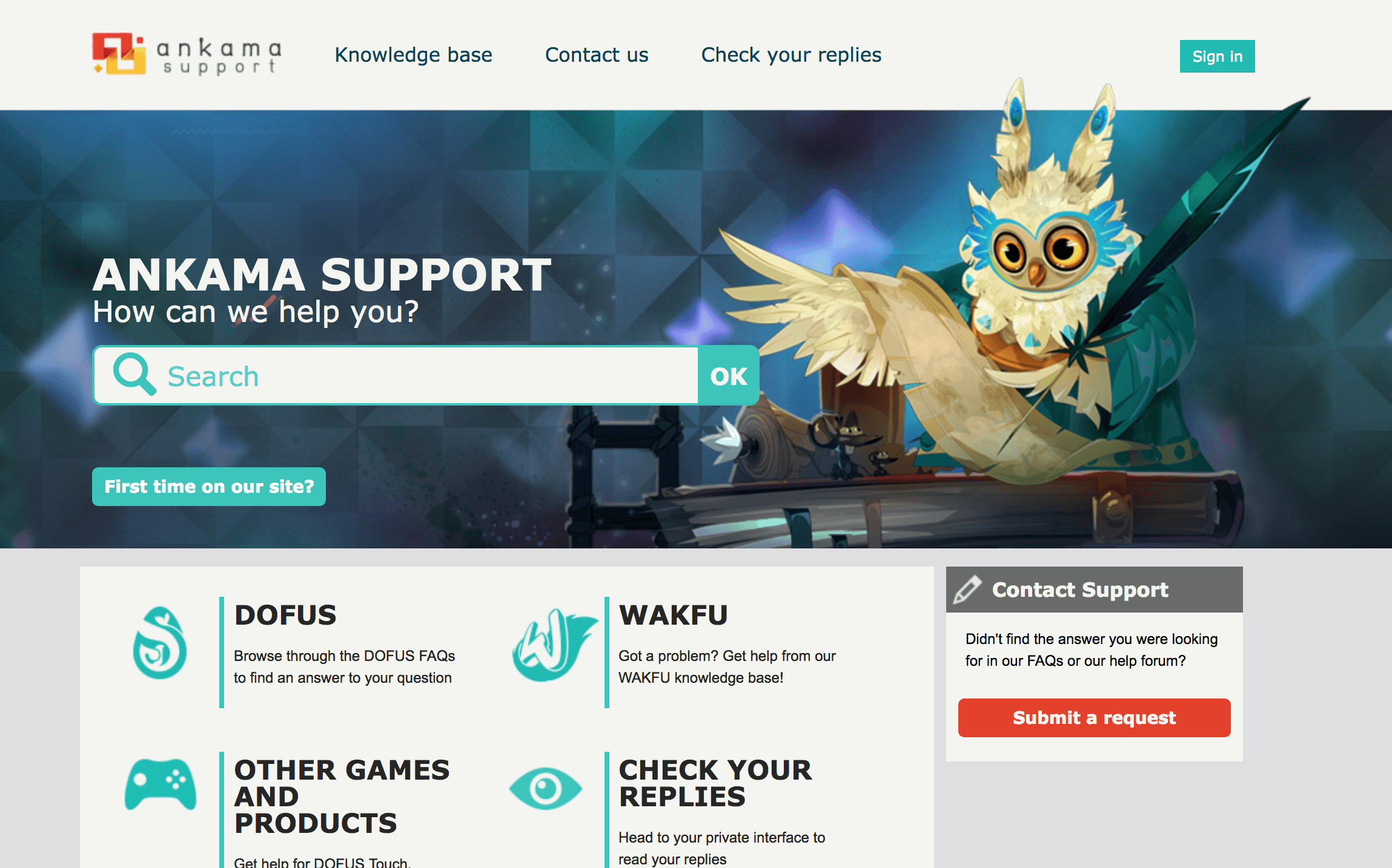
Of course, even though they’ve incorporated some of their awesome artwork into their knowledge base design, their actual documentation is still very simple and plain. This means users aren’t getting distracted by unnecessary features when they are only at your knowledge base to solve a problem (not look at pictures).
Awareness of context
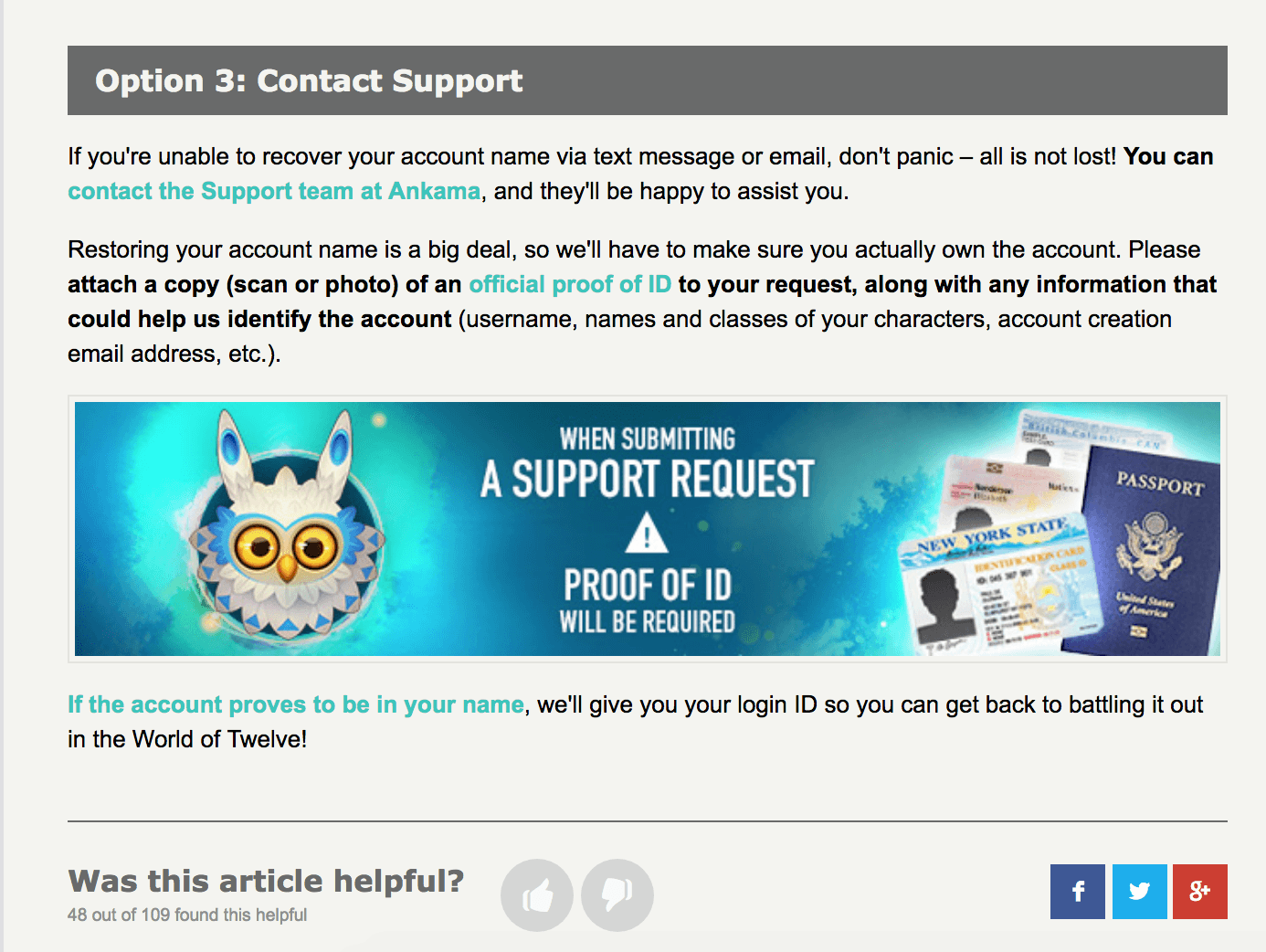
Ankama also make it easy to contact their support team from the knowledge base, and they understand that many users may be panicking at the thought of losing their account. They have awareness of the context in which users are consuming their help content, showing appropriate empathy and helpfulness.
Knowledge base design trends
These knowledge bases are making use of some popular design trends, which will no doubt change as 2018 unfolds.
These trends are:
Custom illustrations and graphics (avoid stock photos if you can)
Asymmetry – making things lopsided is modern
Popping colors – it’s all about grabbing attention
More organic shapes – especially rounded corners
The field of graphic design is a subjective one, and what is fashionable this year will be hopelessly out of date the next. Design your knowledge base so it looks current, but will still be classically beautiful in the years to come.
Here are our tips to help you create a more beautiful knowledge base:
Make your knowledge base fit for purpose above all
Vibrant use of color – aim for more than just the corporate standard
Use inspiring copy in some places to engage your users
Lay your content out clearly so users don’t have to squint
Make your knowledge base on-brand so it feels like part of your company
Showcase your product branding in the design if it feels natural
Make the search bar prominent to help users find what they need
Allow your customers to contact your support agents at all times
Your knowledge base should ideally fit in with the rest of your branding, even if you have a physical product. It shows consistency in the customer experience and your customers will be reassured that you take full responsibility for maintaining your help content (some companies don’t!).
Final remarks
These companies buck the trend of help bases that are too often dry and boring. Boring knowledge bases are seen as a method of last-resort when something’s gone wrong, rather than an opportunity to shine.
While not everyone has the budget to create high-impact graphics and illustrations, you can still make your knowledge base as beautiful as possible to improve your support experience.
If you want to create a knowledge base for your company like the ones we’ve showcased here, our KnowledgeOwl knowledge base software can get you started.
Start a free trial of KnowledgeOwl, no credit card required.

Written by
Catherine Heath
Catherine is a freelance writer based in Manchester who writes blogs, social media content, and copy. She also designs owl-based images. 🦉

Follow these 3 steps to improve your knowledge base
1
Get expert tips every month in your inbox
No spam, pinky promise.


2
Try the knowledge base software your team will fall in love with
Reduce tickets, make information easy to find.
Happier employees, happier customers.

3
Become the tech writer everyone respects
Check out our podcast, The Not-Boring Tech Writer.

How teams are using KnowledgeOwl
Loved by 3,200+ knowledge base authors in software companies around the world